About
This component a part of the 400+ components, layouts, templates, UI Kits and code overrides from SegmentUI PRO. Click here to see the full library
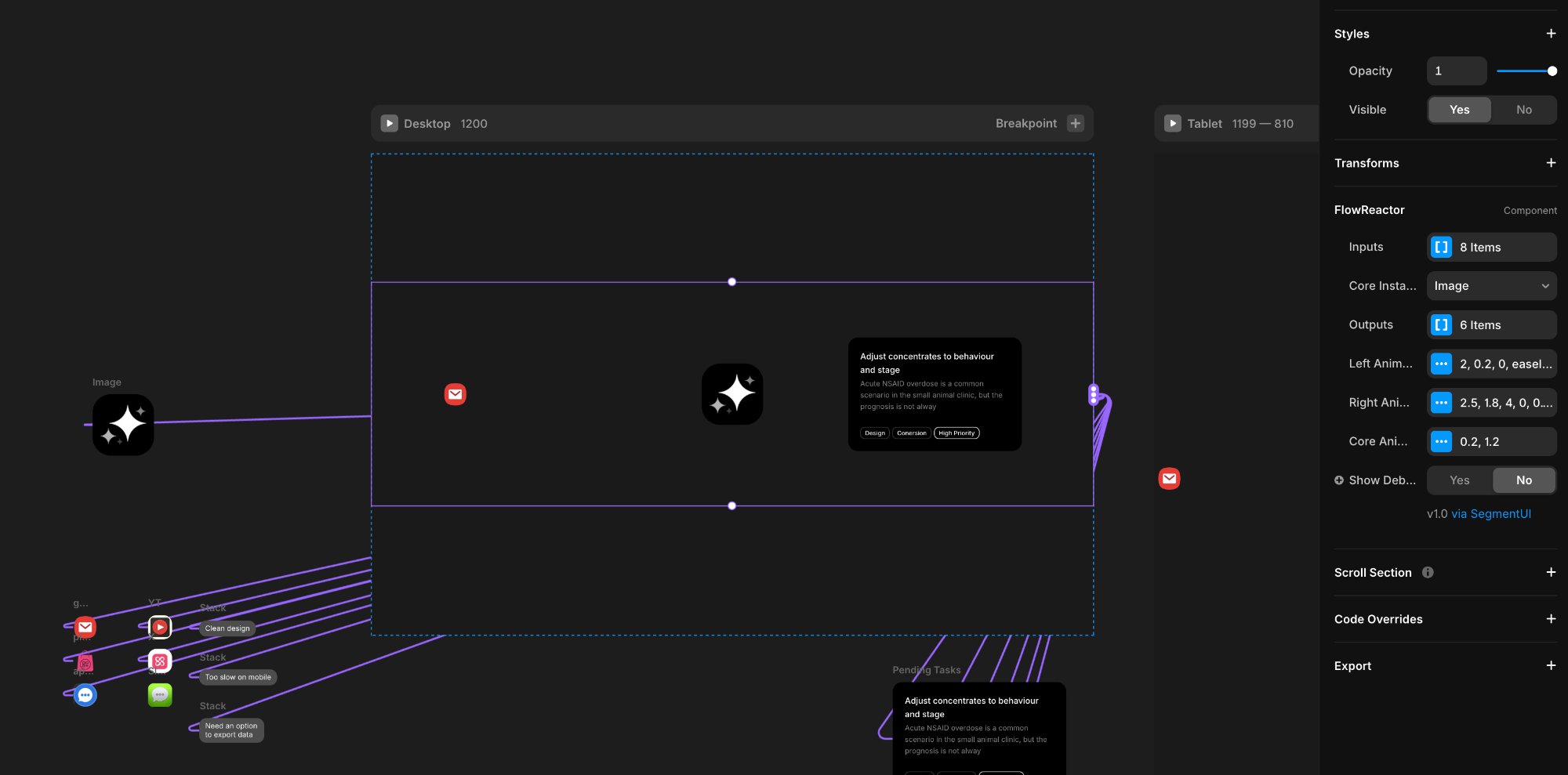
Instructions
- Copy the FlowReactor component from the site and paste it into your Framer project
- Connect your input components to the Inputs array - these can be icons, text labels, or any visual elements representing what goes into your process (feedback, data, raw materials, etc.)
- Connect your core processor component to Core Instance - typically your logo, a central icon, or graphic that represents the transformation
- Connect your output components to the Outputs array - these should represent your refined results (insights, solutions, finished products, etc.)
- Customize the timing and animation: adjust Left Animation for input behavior (travel speed, spawn frequency, entrance/exit effects), Right Animation for output behavior (travel speed, spawn frequency, appearance effects), and Core Animation for the pulse effect intensity and duration
How It Works
The component has three main areas you'll populate with your own design elements. The Inputs section accepts an array of components (icons, text, images - anything) that will continuously spawn from the left side and travel toward the center. The Core is your central processor - typically a logo, icon, or graphic that represents the transformation happening. The Outputs section contains components that emerge from the core and travel to the right edge.
Each section has its own animation controls. Left Animation controls how input items travel (speed, timing between spawns, entrance/exit fading and scaling). Right Animation controls output items (speed, timing, how they appear). The Core Animation sets the pulse effect when outputs are emitted - this pop duration also controls how long output items take to fully appear, creating a synchronized effect. You can fine-tune easing curves, delays, opacity transitions, and scales to match your brand's feel.
What You Get
When you purchase this component, you'll receive:
- The Component Itself - Full access to the component all future updates
- Remix File with Component Setup - A complete Remix file with the component pre-configured and ready to integrate into your project.
- Setup Instructions - Clear, step-by-step instructions to help you implement the component quickly and correctly.
- Dedicated Support - Direct access to our team for assistance if you encounter any issues during setup or implementation.
Support
For any queries and help setting up the component, contact hello@segmentui.com
Refund Policy
If a component does not function as advertised and the issue cannot be resolved, you are eligible for a full refund under our quality guarantee. Refunds will not be provided for any other reasons, including change of mind, accidental purchase, lack of use, or expectations of features not explicitly advertised.


